Fashion for Everybody
SERVICES
Branding
Print Design
Window Art
Web Design
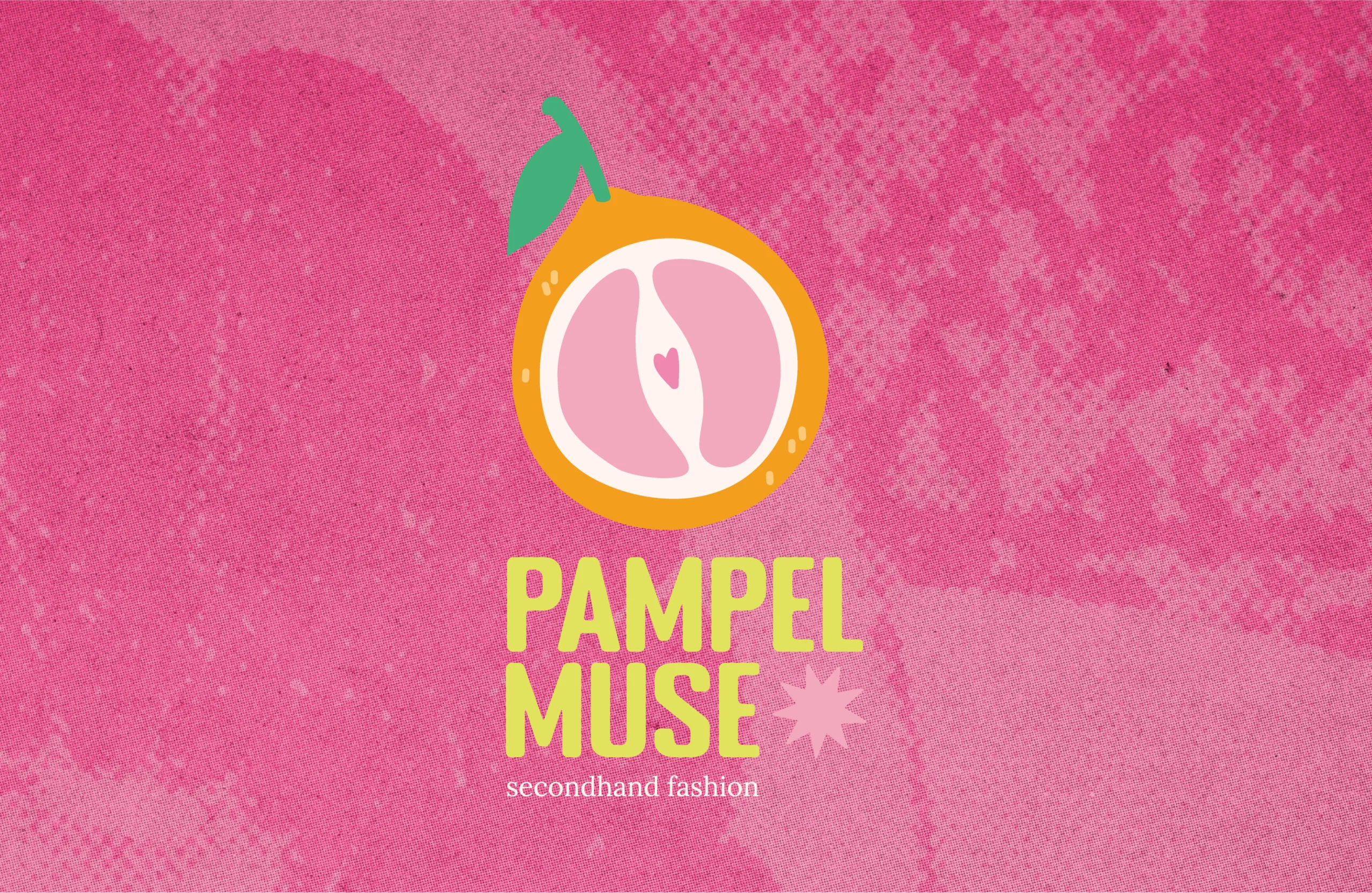
With that concept in mind, I developed a bold and playful visual identity rooted in sustainability, inclusion, and individuality. Inspired by the fruit itself, the branding uses vibrant colors, abstract forms, hand-drawn elements, authentic photos, and analog textures to move away from glossy fashion clichés and instead celebrate real bodies, personal style, and second chances. A flexible logo system was created to meet the diverse needs of the shop.


PRINT DESIGN
Gift Cards & Flyer
Gift cards where needed that felt true to the brand. I took inspiration from old-school fruit stickers, which matched the analog, second-hand feel and allowed me to create a small variation of stickers that gave more character. To keep them practical, I chose a business card format so customers can easily slip them into a wallet and carry them with them.


For the flyer, we stayed within the world of analog print but leaned more into fashion culture. Late 90s and early 2000s magazines, especially titles like Bravo, inspired the layout and tone. The goal was to capture what Pampelmuse stands for while keeping the information clear and direct. The flyer is mainly used at smaller art markets and events, giving people a quick sense of the store’s concept along with the key details they need to visit.

WEB DESIGN
pampelmuse-shop.at
While designing the website, additional visual forms were developed and added to the corporate design. Each one for one of the three key themes: sustainability, inclusion, and individuality.
These forms were then used across the corresponding sections of the website, giving each theme its own visual language.
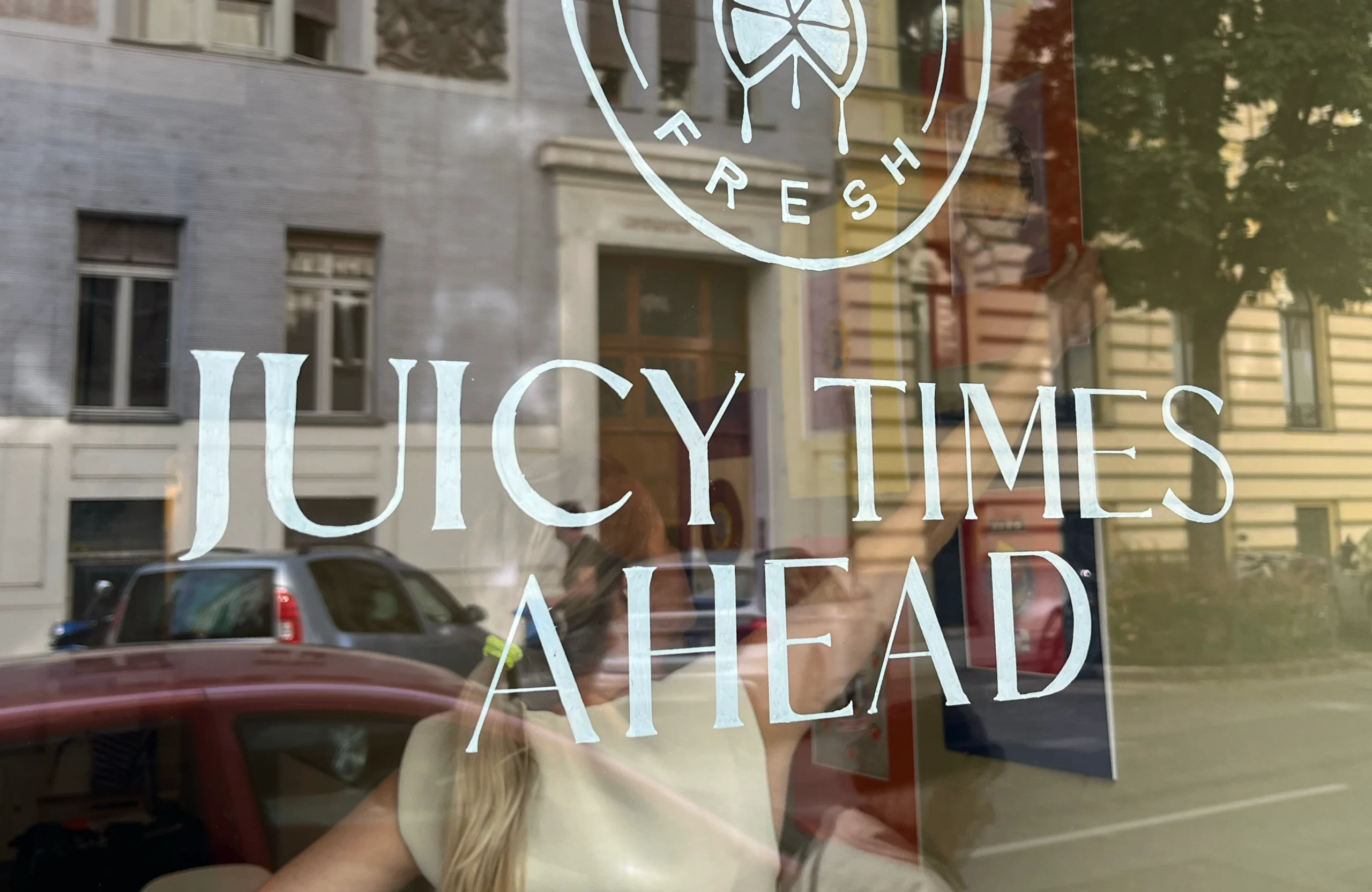
WINDOW ART
New Opening & Color Update
To celebrate the opening of the store, I painted the windows. The themes of the shop were picked up and translated into illustrations to make the new concept visible from the outside.
The main element was a large orange, or “pampelmuse,” shown mid-peel, with the skin used to frame the text, spanning over two windows.